Year Visualizations
Before the start of 2020, I decided I would track how I spend my time during the year in order to reach a better understanding of myself. Little did I know how strange of a year it would be. What began as a fun side project became a way to assess the pandemic’s effect on my life. Now, in retrospect, it serves as a keepsake of how I spent my hours during this unusual time.
Visualization of hourly activities in 2020
Inspiration
Journaling has been used by all kinds of people as a way to reflect, document and improve their lives. A thorough understanding of the self is a prerequisite to self-improvement, and journaling offers this to many people. However, for me personally, keeping a journal has never been sustainable. Writing down the events of the day takes a good amount of time, and so does reading through old entries. A traditional journal only allows the reader to examine one day at a time. Large scale patterns, long-term changes, and correlations between different factors are not easily gathered this way. It was these observations about journaling which prompted me to search for an alternate method of documenting my life.
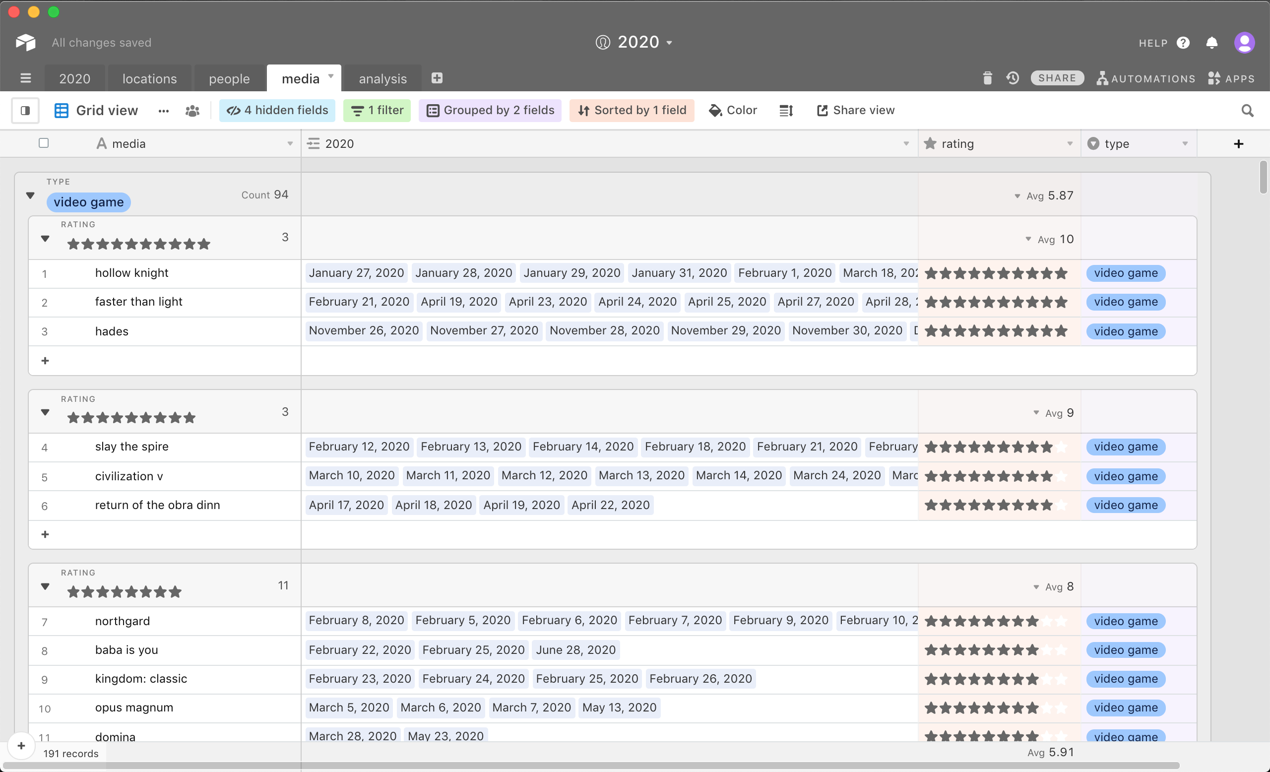
Visualization of the media I consumed in 2020, with colour determined by type and opacity determined by overall enjoyment
Data
Throughout the year, I gathered my data using an Airtable document. I aimed for my listed hourly activities to be as specific as possible, and in the end divided my time into 39 categories. I also tracked the people I spoke to and called, which media I read and watched, my location, my mood, my eating habits and more. I made sure to update the spreadsheet consistently to ensure the data was accurate.
Visuals
Once the year was over, the visualizing stage of the project could begin. This process is still ongoing. The information I was most interested in visualizing was the hourly activity tracker. A huge challenge is in making each of the 39 activities appear distinct within the design. My initial solution, seen here, is to use around four shades of ten distinct hues. However, this was not as successful as I would have hoped, and some activities still appear very similar to others. One solution I am currently exploring to help solve this issue is interactivity. Having the ability to select and view each activity individually has the potential to make the design much easier to navigate and interpret.
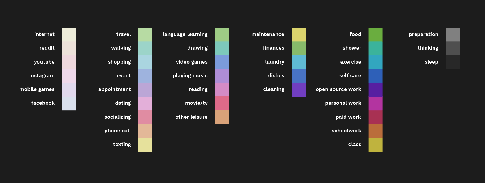
Colours used for each activity
Tools
Previously, I have made all of my information design using Excel and Adobe Illustrator. However, I quickly realized that this workflow would be too inefficient for this project due to the sheer amount of data. To solve this, I learned to use an open-source program called NodeBox. This node-based software allowed me to convert the spreadsheets with my collected data into highly customized graphs which could be further refined in Illustrator. Although using this software was extremely helpful, I experienced several problems. A lack of online resources, a few annoying bugs, and NodeBox’s poor handling of text all made using the program less efficient than I had anticipated.
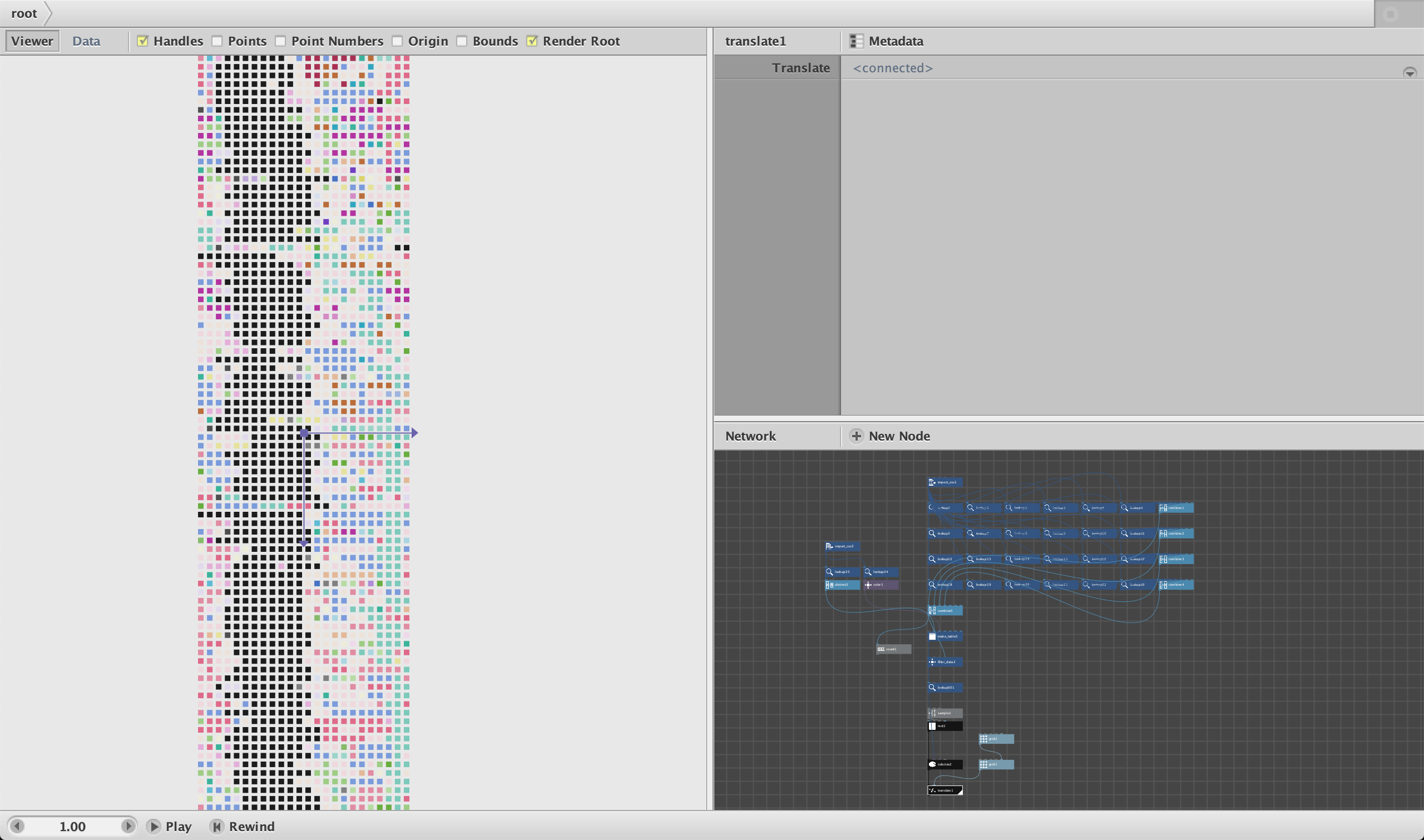
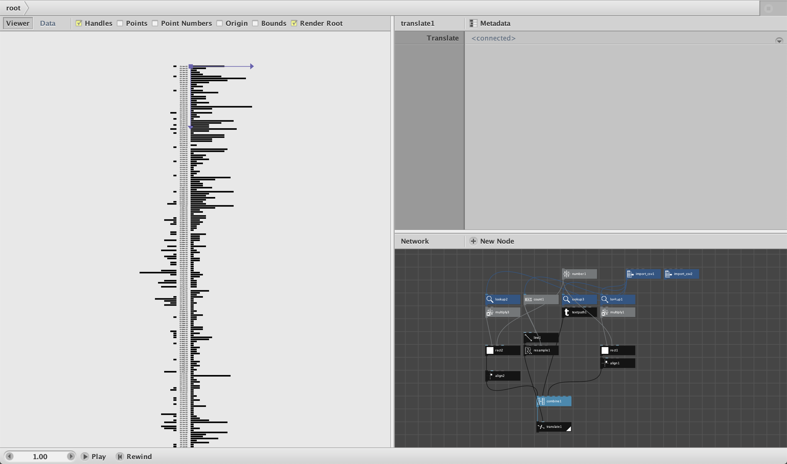
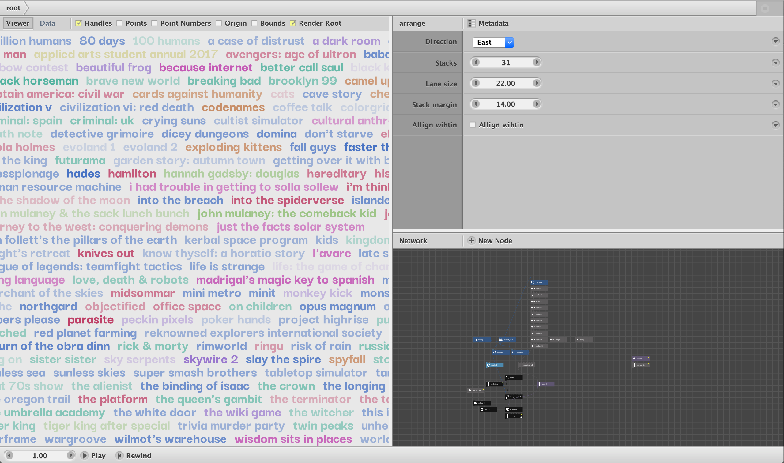
Using Nodebox to create visualizations
Conclusion
Just as I had hoped, correlations between different factors are apparent through this project. One of the most obvious examples is the huge effect of lockdown on the amount of people I spoke to and called with in 2020. On a more personal note, I am glad to have a snapshot of who I was in 2020 to look back on. So much of everyday life is easily forgotten, but this project has finally given me a sustainable method to effectively document how I spend my time in a way traditional journaling has never been able to.